![[Updated] Colors Unleashed Practical Application of Color Theory for 2024](https://thmb.techidaily.com/eb0b88fc8ea01a6f57ac593062a230bcd4f411a04c405e68f58f5857acd450ec.jpg)
"[Updated] Colors Unleashed Practical Application of Color Theory for 2024"

Colors Unleashed: Practical Application of Color Theory
So, you’ve heard about color theory but don’t know what it is or how to use it and you may also be wondering what color theory could possibly have to do with you. We are talking about the theory of all color combinations and how they can be altered or selected to better work together creating a more pleasant viewing for your audience.
If you are more selective with your colors in your videos or imagery the viewer will find this aesthetically pleasing and may be more engaged in your content. This includes anything from logo design all the way to props for your shot. When creating your videos within Filmora it is good practice to think about your composition in all aspects including color theory and with the guide hopefully you will have a better understanding of how you can influence your color palette.
What Is Color Theory
Color theory consists of many elements that could fill a library on its own but for this guide we will focus on two key elements. The color wheel and color harmony. By understanding the color wheel and color harmony you can hand pick which colors to add or use in your pieces to create a well-balanced viewing experience which can help in viewer engagement and enjoyment.
There are many color wheels out there and all require understanding and research into that particular color arrangement but for this guide I will be focusing on the more widely used RGB which derives from the primary colors red green and blue, If you’re thinking why red green and blue not red yellow and blue then you are observant, while RYB is taught as the three primary colors we will be using what is known as additive primary colors of light meaning the more you add of these colors the closer to white you get, the reason we will be using this combination is due to the fact RYB misses a lot of hues around the violet area and the blue-greens meaning we achieve a higher range of color to pick from. With this in mind let’s start.
The Color Wheel
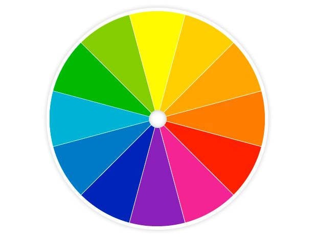
Using red, green and blue as primary colors we can mix the colors to one another to get our secondary colors giving us yellow, magenta and cyan. We can mix these to one another to create our tertiary colors which are raspberry, orange, sprig green, turquoise, ocean and violet giving us something which looks like this

As you can see, we have every color available in this wheel and they are arranged in a unison with the mixed colors starting with red, green and blue and working towards each other.
Color Harmony
So now we know how the wheel is made and what it looks like. What does it do? We can use this wheel now to gather our palette. Within color theory we talk about harmonious colors that work together in a pleasant way creating less stress on the eyes to find information in your scene.

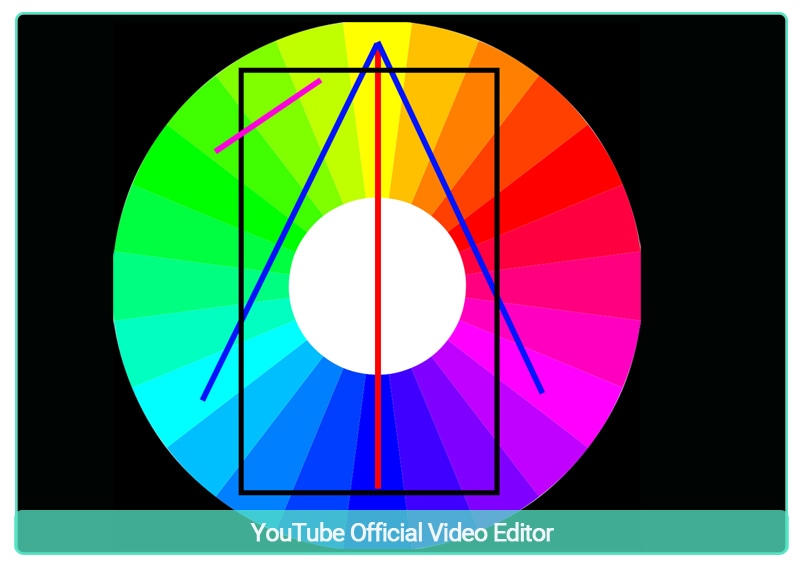
One such harmony is complementary colors and luckily for us this is very easy to find. You take your base color and find the opposite color on the wheel. In this example the complementary color to blue is yellow depicted with a red line.
These colors always work as they create contrast and stability.
The blue lines represent what is known as split contrasting colors and these will create balance with each other.
The corners of the black rectangle land on what is known as tetradic complement and allows you to add four colors with the understanding that they will complement each other perfectly. Lastly is the purple line which represents the analogous complementary colors, you can pick these neighboring colors with the peace of mind that they will harmonize with each other. There are many more but these four are the main ones that you will use more often than any other, by selecting colors using these four main types you can create a palette for your scenes and allow the viewer to effortlessly enjoy your content. These types work no matter where you start from on the wheel so long as you keep the distances the same.
But How Do I Use This
You may still be unsure as to how to implement color theory into your videos. Let’s look at some scenarios that color theory may help your creations.

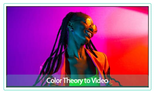
In this scene the director decided that the backdrop should complement the top the actor is wearing, looking at our wheel we can see the complementary color would be dark purple so they started with that, to create a more dynamic scene they then used the analogous colors of that purple being pink and red and created the backdrop. This creates a harmony within the scene and makes it effortless to see all the key elements straight away.
As you can see from this example the base color for the scene is a dark blue/purple and using the analogous color of pink they created a point of interest within the scene that doesn’t look out of place. This is a very good way to pull the viewers eyes towards something you want them to take in above all else.

As you can see from all the movie covers above, they all use complementary colors from the blues to the war yellows and oranges, this creates high contrast and balance and is something done within the movie industry in every scene. It’s no coincidence that the joker is purple and green or that the iron man is red and gold, this is well prepared and researched in the planning stages of everything a visual artist creates.
Conclusion
By including this into your thought process when creating videos with Filmora you will achieve well balanced and harmonious content for your viewer to enjoy and create better engagement. It’s not by chance these things happen though, it’s through research and planning that the most iconic scenes and characters are created and this is just one small brick in the foundations of content creation. With practice this will become second nature to you and that is the main goal of this guide.
Free Download For Win 7 or later(64-bit)
Free Download For macOS 10.14 or later
Free Download For macOS 10.14 or later
Also read:
- [New] 2024 Approved GiggleGraph Make Amusing Graphics Swiftly
- [New] 2024 Approved Unraveling the Secrets to Gently Fading Audio in Audacity
- [New] In 2024, Boost Your Video's Popularity on YouTube
- [New] In 2024, Immersive Stories That Keep You Watching (Within Limit)
- [New] In 2024, Top 6 Budget-Savvy 4K Large Screen Options
- [Updated] 2024 Approved Navigating Video Chats Zooming In on Xbox
- [Updated] In 2024, Turning XML/SSA/TTML Into SRT Practical Steps
- [Updated] LaughLineup App - Become a Master at Memes for 2024
- [Updated] Perfecting Zoom on Snapchat for Better Snaps
- [Updated] Photoshop Shake Reduction - Is It Really Useful, In 2024
- Ace Search Engine Rankings on YouTube 11 Proven SEO Methods for 2024
- Android to Apple How To Transfer Photos From Oppo A78 to iPad Easily | Dr.fone
- Cutting-Edge Online Resources for Glittering 3D Typography
- In 2024, UltimateGlobalVision Select Live and Home Channels Together
- New In 2024, Top HD Video Editors for Creators and Professionals
- Say Goodbye to Chrome's Glitchy Glow: A 2024 Definitive Repair Manual for Windows Enthusiasts
- Transform Your WAV Audio Files Into MP3 Format: 4 FREE Online Conversion Methods
- Title: [Updated] Colors Unleashed Practical Application of Color Theory for 2024
- Author: Donald
- Created at : 2025-01-04 23:59:54
- Updated at : 2025-01-11 00:05:48
- Link: https://article-posts.techidaily.com/updated-colors-unleashed-practical-application-of-color-theory-for-2024/
- License: This work is licensed under CC BY-NC-SA 4.0.